iNewsDesign
Back to Basics
SPD Amazon Store
The elves at SPD are back and have been busy once again to celebrate the season. They have created a whole new list to help you find that perfect present for your favorite art director, photo editor, illustrator, photographer, or creative person. We’ve made an Amazon store for one stop shopping on all these great … Continue reading
Mihajlo Arsovski’s design for Arsen Dedić, “Čovjek kao ja” LP in MoMA
Mihajlo Arsovski, Photography by Zvonimir Golob Album cover for Arsen Dedić, Čovjek kao ja 1969 Location MoMA, New York Dimensions12 1/4 × 12 1/4″ (31.1 × 31.1 cm) Credit Gift of Mirko Ilić Object number: 854.2015 Copyright: 2015 Mirko Ilić Department: Architecture and Design Read More…
Pantone’s Color of the Year Blends Two Shades
Pantone, an X-Rite company and the global authority on color and provider of professional color standards for the design industries, today announced PANTONE 15-3919 Serenity and PANTONE 13-1520 Rose Quartz, as the PANTONE Color of the Year selection for 2016; a harmonious pairing of inviting shades that embody a mindset of tranquility and inner peace. … Continue reading
William Wegman shoots Bloomberg Pursuits Holiday Gift Guide
For the holiday issue of Bloomberg Pursuits, online today, legendary photographer William Wegman ingeniously poses his signature Weimaraners with the best gifts of the season. Wegman has been photographing his Weimaraners since the 1970s, and they’ve appeared everywhere from MoMA to Sesame Street. For Pursuits, Wegman dresses his adorable canine co-conspirators, Flo and Topper, in … Continue reading
Brain friendly design for news websites
Elements of brain-friendly design Reader experience can be significantly improved by: Formatting the text of the story into shorter paragraphs. Highlighting important story facts and terms. Clean, uncluttered page design. Similarly, distracting elements accompanying the story can reduce comprehension: Flashy advertisements. Photos and links to unrelated stories. How do news readers perceive and learn from … Continue reading
Street Photographer
Being a street photographer is a bit like conducting a drunk symphony: You must make order of chaos. Only a few photographers do it well, and many of them appear in Cheryl Dunn’s film, Everybody Street, which chronicles the street photography of New York City. Dunn chose New York because it always has been at the center of … Continue reading
How to design fixed layout EPUB
Learn how to make an eBook with rich imagery and elaborate layout that looks just like the InDesign document without writing code. Click photo to see video at Adobe TV. What do I need? Get files Sample files to practice with (ZIP, 154 MB) Get PDF InDesign cheat sheet Create a highly visual eBook and … Continue reading
Celebrating Twenty-Five Years of Original Type at Adobe
Good typography is something everyone sees but no one notices. – John Warnock, Adobe co-founder In the mid- to late 1980s, designers rapidly embraced the brave new world of desktop publishing, and demanded more and better typefaces to use in their projects. In response to those cries for creative help, Adobe launched the Adobe … Continue reading
Typeface Vs Font. The look and the mechanism.
Typeface: is the design. The shape of the letters, numbers, and symbols that make up a design of type. Font: is the digital file that contains/describes the typeface. A font is one weight, width, and style of a typeface. In brief: A font is what you use, a typeface is what you see. Font vs. … Continue reading
Tracking and kerning
Designers can spend hours poring over the tracking and kerning of their typography. It’s important, however, to understand that the two things are not synonymous. Tracking, as we’ve already mentioned above, deals with the spacing between characters across an entire word or phrase. Kerning is an adjustment of the specific space between two characters in … Continue reading
Aston Martin DB10

Production will be strictly limited to 10 of the bespoke sports cars, developed and built by the designers, engineers and highly skilled craftspeople at Aston Martin’s Gaydon headquarters.
Architect Oscar Niemeyer

"My work is not about form follows function, but form follows beauty or, even better, form follows feminine."
BACK to BASICS: Portraits
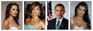
Portraits of people are one of the first elements of the photography used in newspapers.
Typography: x-heigh

In typography, x-heigh refers to the heigh of lower case letters without upper or lower parts when compared to capital letters...
Designer George Lois

“I always knew I was the most talented kid in the school, ” says George Lois of his time at Music and Art. “I was lucky to be exposed to the city’s best art education"...
BODY COPY
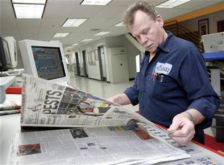
Newspaper typefaces require a higher legibility then typefaces used for other printed products. Newspaper are printed on a paper of lesser quality under high speed.
How to redesign 1
Good redesign is driven by a deep understanding of the editorial mission of the publication.
Headline on photographs

The eternal dilemma! Dilemma of all editors on the planet Earth – to put or not put the headline or any kind of type in the photo.
Design Facts

Three elements that will greatly help you to understand how readers are observing you.
Typeface: NY Times Magazine
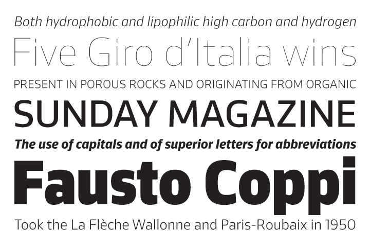
Sunday Magazine is an expansive family of fonts for information in tiny spaces and headlines at large sizes.
Infographics
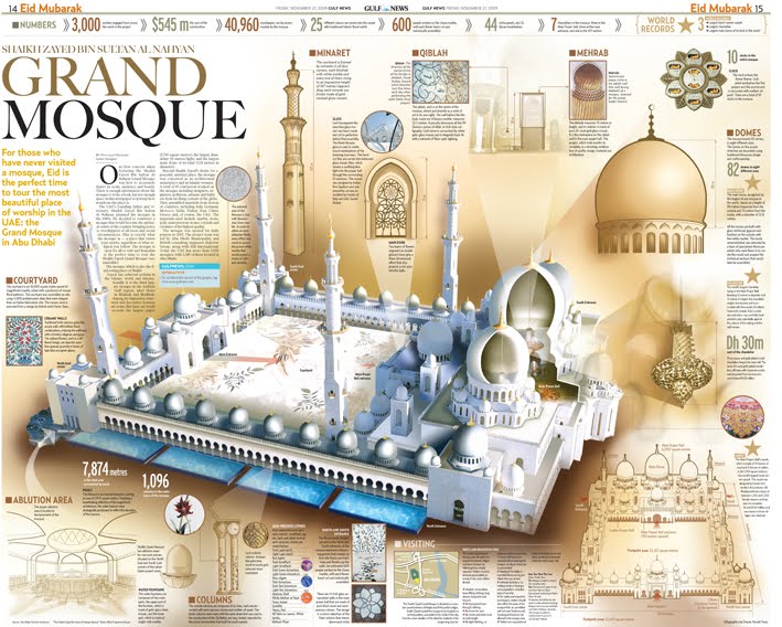
When, why and whether to use infographic. The basic fact is that infographic refresh the publication, and it contributes to originality of your product.
A well-designed publication
Everything that a well-designed publication must have...
