iNewsDesign
Typeface
New fonts from TypeTogether and Rui Abreu
We are thrilled to announce a full shelf of new releases at Typekit today. You can now get your hands on new fonts, extended families, and added desktop availability from two longtime Typekit foundry partners: TypeTogether and Rui Abreu. Let’s get to it. The lovely Essay Text by Stefan Ellmer is a serif … Continue reading
Celebrating Twenty-Five Years of Original Type at Adobe
Good typography is something everyone sees but no one notices. – John Warnock, Adobe co-founder In the mid- to late 1980s, designers rapidly embraced the brave new world of desktop publishing, and demanded more and better typefaces to use in their projects. In response to those cries for creative help, Adobe launched the Adobe … Continue reading
Top Web Fonts of 2013: Extensis Reports
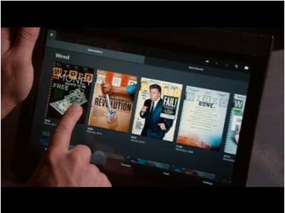
As the new year is fast approaching, it’s always a time to look back at the past 12 months. One thing about this retrospective approach that we share with all of you font fanatics out there (we know who you are…) is that we’re curious to know which fonts have been the most popular this … Continue reading
45 Brilliant High Quality Free Fonts To Boost Your Designs
In this collection, you’ll find some of the best free and high-quality sans serif fonts for clean and professional designs that you can download on the web. Rex Free Font Rex is a font family with three weights – light, bold and bold inline – that was designed to create unique titles on the fly. … Continue reading
Idlewind, new sans serif from H&FJ
Suggestion: Idlewind with Knockout Idlewind with Claimcheck A distinctive typeface that’s at home everywhere it goes. For the longest time, we’ve been reaching for a typeface that wasn’t there. We knew it was something spare and tranquil, its letterforms reaching ambitiously outward, and we could hear it speaking in hushed but captivating tones. We imagined … Continue reading
Type Speciment for iPad. New Generation.
Type Specimen is the first font viewer for iPad, revolutionizing the way digital fonts are presented today. It’s an ideal tool for people who need to select fonts for projects – be it magazine design, corporate identity design, web applications, or book typesetting. Type Specimen is a quick and easy way to navigate the type foundry, … Continue reading
Recommended type: Apres RE Family
David Berlow and staff drew Apres as part of a series designed originally for the Palm Pre smart phone, for use both on the device and in print marketing. Simple, open letterforms and generous proportions provide a clear, comfortable, and inviting experience for navigation and readability. The plain-spoken geometry is regular and balanced, without being … Continue reading
Ideal Sans, a handmade typeface for a machine-made age
Ideal Sans by Hoefler & Frere-Jones Setting aside the easy pursuit of digital perfection, Ideal Sans favors handmade forms that help it achieve different goals: warmth, craftsmanship, and humanity. The first sans serif typefaces, designed in the early nineteenth century, bore the names of ancient cultures — “Egyptian,” “Ionic,” “Doric”, “Gothic” — even though these … Continue reading
Recommended type: Numbers
The world is filled with recognizable and unique numbers that have never been available as fonts — until now. Every year, Pentagram chooses twelve beloved typefaces for its iconic Pentagram Calendar. Traditionally, the calendar features works by typographers past and present, from timeless standards like Garamond and Bodoni to modern classics such as Knockout and … Continue reading
New York Times
New York Times Magazine Project Art direction by Arem Duplessis and Gail Bichler.Commissioned to replace the magazine’s trusted go-to sans Helvetica, Sunday is an expansive family of fonts for information in tiny spaces and headlines at large sizes. Exclusive to the New York Times until 2011. Design: Eric Olson.processtypefoundry.com
Aston Martin DB10

Production will be strictly limited to 10 of the bespoke sports cars, developed and built by the designers, engineers and highly skilled craftspeople at Aston Martin’s Gaydon headquarters.
Architect Oscar Niemeyer

"My work is not about form follows function, but form follows beauty or, even better, form follows feminine."
BACK to BASICS: Portraits
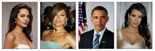
Portraits of people are one of the first elements of the photography used in newspapers.
Typography: x-heigh

In typography, x-heigh refers to the heigh of lower case letters without upper or lower parts when compared to capital letters...
Designer George Lois

“I always knew I was the most talented kid in the school, ” says George Lois of his time at Music and Art. “I was lucky to be exposed to the city’s best art education"...
BODY COPY
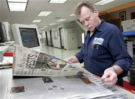
Newspaper typefaces require a higher legibility then typefaces used for other printed products. Newspaper are printed on a paper of lesser quality under high speed.
How to redesign 1

Good redesign is driven by a deep understanding of the editorial mission of the publication.
Headline on photographs

The eternal dilemma! Dilemma of all editors on the planet Earth – to put or not put the headline or any kind of type in the photo.
Design Facts

Three elements that will greatly help you to understand how readers are observing you.
Typeface: NY Times Magazine
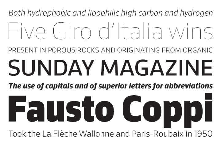
Sunday Magazine is an expansive family of fonts for information in tiny spaces and headlines at large sizes.
Infographics
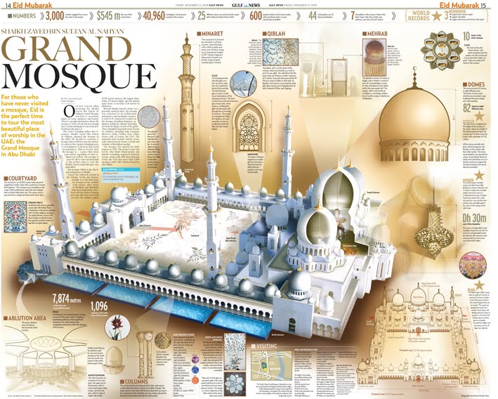
When, why and whether to use infographic. The basic fact is that infographic refresh the publication, and it contributes to originality of your product.
A well-designed publication
Everything that a well-designed publication must have...
